The Brushstrokes of Hyrule: My Journey Through Zelda's Evolving Canvas
Explore Zelda’s stunning visual evolution, from pixel art to cinematic realism, showcasing artistry that transcends technology and ignites emotion.
I remember tracing my fingers across the screen as if touching stained glass, each pixel in A Link to the Past glowing like trapped starlight in a jar—a testament to how artistry transcends technology. Across decades, Zelda’s worlds have whispered secrets through their visuals: the melancholy haze of Twilight Princess’s twilight realm, the sun-drenched optimism of Wind Waker’s cel-shaded waves, the fractured anxiety of Majora’s Mask’s ever-looming moon. These aren’t mere aesthetics; they’re emotional compasses guiding us through Hyrule’s soul. Like a master painter switching mediums between canvases, Nintendo reinvents its palette with each era, proving that innovation lives where technology dances with imagination. This visual alchemy transforms landscapes into memories, making us not just players but pilgrims in a sacred gallery of interactive dreams. ✨
🎭 The Duality of Dimensions: A Link Between Worlds
When Link melted into walls like a shadow becoming one with stone, the 3DS’s stereoscopic magic didn’t just bridge dimensions—it dissolved them. This mechanic wasn’t gimmickry; it was poetry. As I navigated dungeons where 2D and 3D coexisted like parallel realities shimmering in heat haze, the game honored A Link to the Past’s legacy while painting it anew. People Also Ask: How do hybrid dimensions deepen puzzle design? By forcing perception shifts where walls become doors and flatness reveals hidden depths, turning environments into layered riddles.
🌅 Ocarina of Time: Where Polygons Breathed
Even now, Hyrule Field’s sunrise—a wash of oranges over jagged, low-poly hills—feels like watching dawn break through frosted glass. In 1998, those blocky textures were revolutionary brushstrokes; today, they’re nostalgic hieroglyphs. The Zora’s Domain waterfalls, crystalline and pixelated, flowed with liquid grace that defied technical limits. Its genius lay not in realism but in suggestion—using color and composition to make our minds fill gaps like ink blooming on wet paper.
🌑 Twilight Princess: Shadows Woven from Darkness
Gloom clung to this Hyrule like velvet drapes in an abandoned theater. Twilight Princess traded Wind Waker’s cartoonish curves for gothic angles and desaturated hues, its wolf-Link sequences drenched in amber twilight—a visual metaphor for duality. People Also Ask: Why choose realism after cel-shading? To mirror the narrative’s maturity: corruption seeping through cobblestones, light struggling against encroaching shadows. This wasn’t darkness for shock value; it was chiaroscuro storytelling.
🧩 The Pixel Alchemy of A Link to the Past
Each 16-bit tile in ALTTP felt hand-stitched, transforming hardware limitations into virtues. Death Mountain’s pixelated lava wasn’t primitive; it was abstract expressionism—a red-orange tempest evoking heat through minimalism. Like mosaic artisans crafting grand murals from tiny shards, developers built a world where restraint amplified wonder.
| Game | Art Innovation | Emotional Palette |
|---|---|---|
| The Minish Cap | Toy-like vibrancy | Whimsy & discovery |
| Skyward Sword | Impressionist brushstrokes | Dreamlike wonder |
| BotW/TotK | Cel-shaded minimalism | Serene vastness |
🧸 The Miniature Magic of Link’s Awakening & Echoes of Wisdom
Here, tilt-shift transformed Koholint into a diorama—a snow globe world where palm trees resembled plasticine and characters felt like articulated dolls. This wasn’t mere nostalgia; it was tactile intimacy, shrinking epic adventure into something held gently in cupped hands. People Also Ask: How does scale manipulation affect immersion? By making cliffs feel like garden rocks and puddles like oceans, amplifying wonder through perspective shifts.
🌙 Majora’s Mask: The Pendulum of Apocalypse
That moon—cratered and scowling—hung like a cracked clock weight over Termina, its descent measured in sweat-slicked panic. Darker than Ocarina, it used surrealism: masked transformations warping bodies like melted wax, time loops folding reality. The art wasn’t just style; it was psychological pressure, turning skies into clenched fists.
🖌️ Skyward Sword’s Living Painting
Swirling clouds over Skyloft bled watercolor edges, while landscapes resembled Van Gogh textures applied with palette knives—thick, visible strokes giving form to floating islands. This impressionist approach elevated gameplay: painted light guided sword angles, and vivid hues highlighted climbable vines like bold underlines in a storybook.
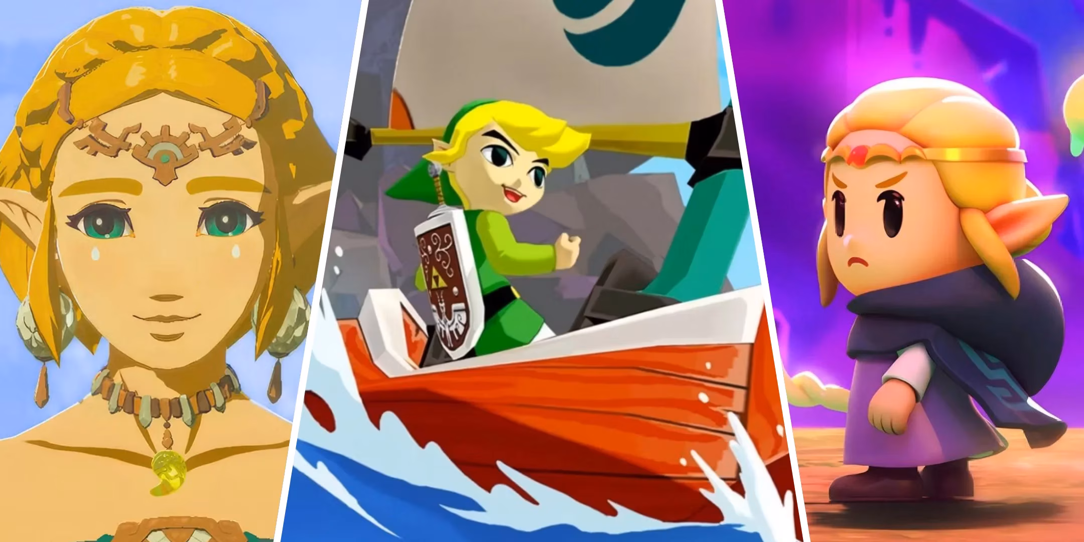
🌊 Wind Waker: When Controversy Became Canon
Initially dismissed as “kiddy,” its cel-shaded waves now feel timeless—an ocean carved from sapphire glass. Toon shading’s bold outlines and gradient skies aged like calligraphy ink on parchment, outlasting “realistic” contemporaries. People Also Ask: What makes cel-shading timeless? By embracing stylization over fidelity, it sidesteps the uncanny valley, letting expression trump resolution.
🗺️ Breath of the Wild & Tears of the Kingdom: Minimalism as Majesty
Hyrule here breathed with pastel tranquility—mountains layered like rice paper collages, cel-shaded trees bending in winds you could almost smell. This wasn’t empty space; it was visual haiku, using negative space to frame moments: a lone shrine glowing amber at dusk, paragliders slicing through mist like origami birds. 🕊️
As we await the next evolution, I wonder: In an industry chasing photorealism, will Zelda’s bold stylizations remain its compass? Like kintsugi pottery mending cracks with gold, the series transforms limitations into beauty—proving that true artistry lies not in mirroring reality, but in distilling its essence into something that haunts the heart long after screens darken.